· design · 1 min read
BRANCHENBUCH
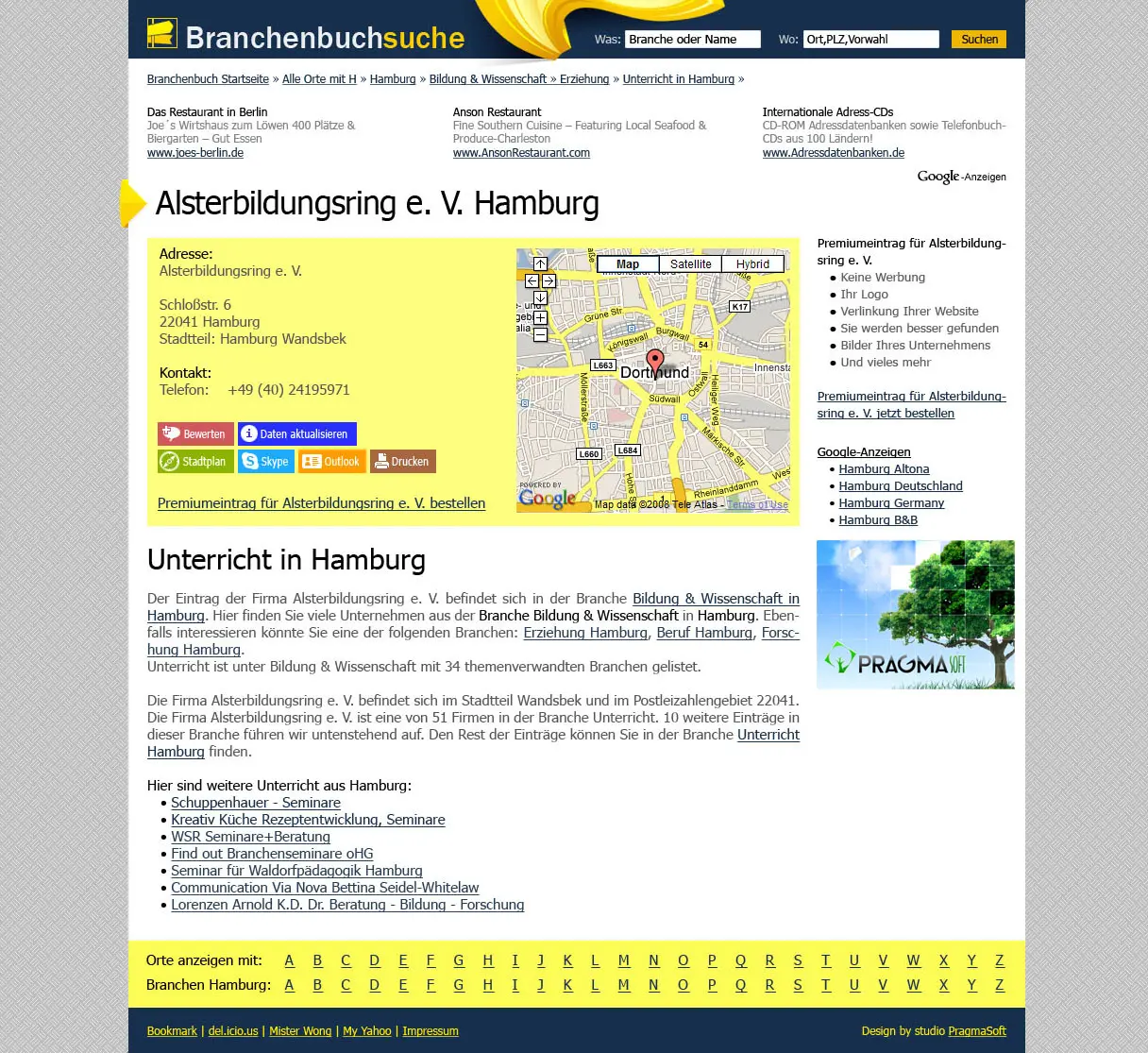
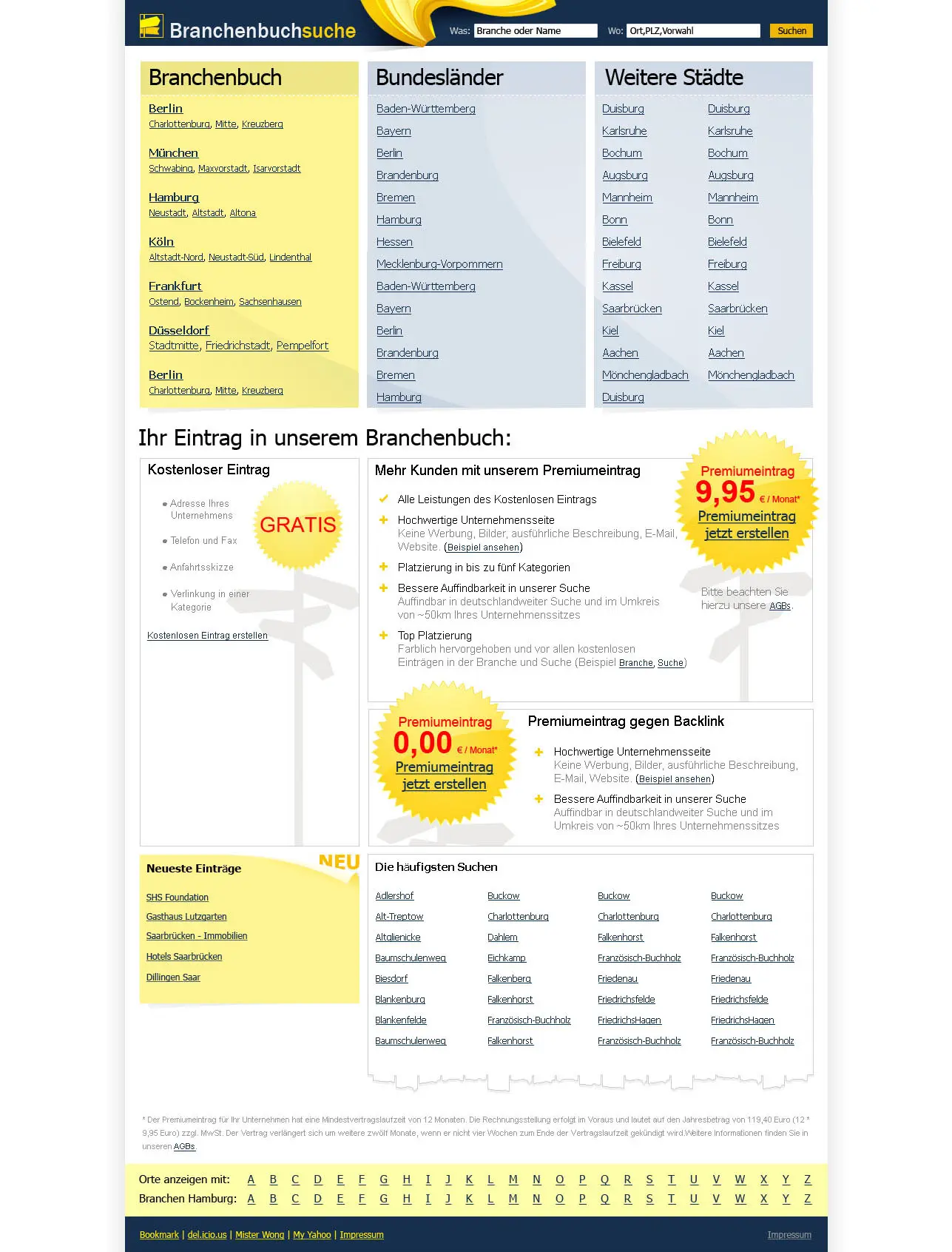
Technologies: web design, UI optimization, logo design, icon design, XHTML/CSS.
Clean design for a German online yellow pages directory.
The main requirement for this project was to provide clean Web 2.0, Google-like design.
In terms of this project we were responsible for logo and icon development. We thought against using ‘running fingers’ logo (which is a traditional yellow pages logo) to make BranchenBuchSuche stand out - we used the idea of sign post, as a media to provide the needed info! We also decided not to use bright yellow color as dominating in design, and we went for clean, white design - for it to be convenient and non-aggressive for every-day use.
While developing icons, we decided to implement color coding there. In such way a user will look for specific colors while using the site: he would be looking for blue when he wants to skype, he will be guided by brown, when he wants to print the info, and so on.
What is there else to say - just take a look at the design!
